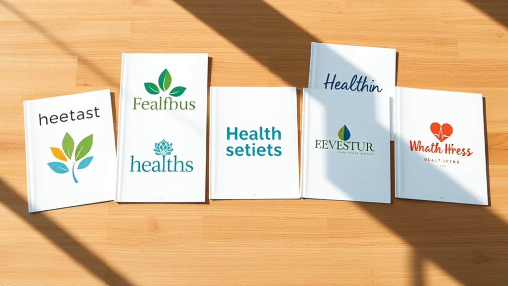
7 Inspiring Health Magazine Logo Ideas
Creating a health magazine logo that feels trustworthy, memorable, and aligned with your audience can be challenging. You’re not alone—many publishers struggle to balance wellness, energy, and professionalism in one design.
These health magazine logo ideas can help you find the right direction.
You’ll find seven inspiring health magazine logo ideas, from nature-inspired leaves and trees to minimalist marks for modern wellness. Try botanical sprigs for a fresh, trustworthy feel, or use lotus flowers, circles, and balanced stones to suggest mind-body harmony.
Fitness-focused designs benefit from energetic colors and sturdy type, while soft neutrals and flowing forms suit holistic health. Bold, type-first logos create authority with clarity and impact.
Delve into the ideas below to shape a memorable, versatile identity.
Key Takeaways
- Pair bold sans-serif typography with a memorable symbol to create an authoritative, recognizable health magazine logo.
- Use botanical elements such as leaves, flowers, or trees to communicate wellness, growth, and natural living.
- Apply calming greens, warm creams, muted blues, or earthy tones to reinforce health, balance, and approachability.
- Explore lotus flowers, circles, balanced stones, or flowing forms to express renewal, harmony, and inner wellbeing.
- Keep designs simple, scalable, and high-contrast so logos remain clear on magazine covers, websites, and mobile icons.
Nature-Inspired Health Magazine Logos

Nature-inspired health magazine logos use leaves, trees, flowers, and organic shapes to suggest wellness, balance, and natural living. When you choose this direction, connect your publication with the calm, restorative qualities readers associate with the outdoors.
Nature-inspired logos connect health publications with wellness, balance, and the restorative calm of the outdoors.
A leafy wreath can frame your title, while a tree silhouette can represent growth, strength, and long-term wellbeing. Flowers may add warmth and approachability, especially for content focused on self-care, nutrition, or emotional health.
You can also investigate urban inspired motifs, such as rooftop gardens, botanical line drawings, or city parks, to reflect healthier living in modern communities.
For a heritage-focused publication, vintage emblem designs can create trust through badges, banners, engraved textures, and classic botanical illustrations.
Select earthy greens, clay tones, warm creams, or muted blues to reinforce the theme. Make sure every symbol supports your magazine’s purpose and remains recognizable across covers, websites, social profiles, and printed materials.
Combine natural imagery thoughtfully, so your logo feels distinctive rather than crowded or predictable.
Minimalist Logos for Modern Wellness

For a cleaner, more contemporary direction, minimalist logos for modern wellness rely on simple shapes, balanced spacing, and restrained typography. You can create a confident identity by pairing one memorable symbol with a clear wordmark.
Choose geometric forms, smooth lines, or subtle letter modifications to suggest balance without overwhelming your audience.
Thoughtful color palette selections also strengthen the message. Soft neutrals, muted blues, or a single energetic accent can communicate calm, trust, or vitality while keeping the design focused.
Limit decorative details so your logo remains recognizable at a glance and works across print, digital covers, social profiles, and merchandise.
Pay close attention to logo scalability considerations before finalizing the concept. Your mark should stay crisp as a small favicon and remain visually compelling on a large banner.
Use consistent spacing, readable type, and strong contrast to ensure accessibility. A minimalist logo doesn’t feel empty; it gives your magazine room to speak.
Botanical Logos With Leaf and Herbal Motifs
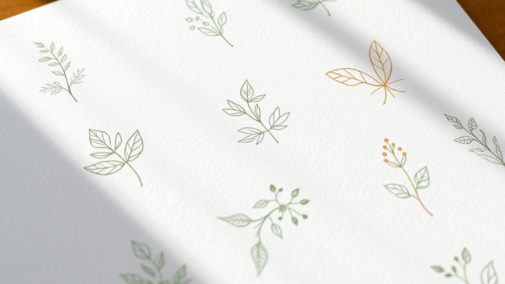
Leaf and herbal motifs can give your health magazine logo a fresh, grounded personality. Choose clean, recognizable foliage to suggest natural ingredients, garden freshness, and thoughtful nutrition without making the design feel busy. A single curved leaf can frame your magazine name, while a small sprig can create a refined accent beside a headline.
Consider combining varied shapes to build a distinctive botanical identity. You might pair a rounded leaf with a delicate flower petal, or arrange thin stems into a simple emblem. Keep each element purposeful, and avoid overly detailed illustrations that may disappear at smaller sizes.
A limited palette of sage, forest green, cream, or warm brown can reinforce the organic character while keeping your logo versatile.
Let your herbal motif match your publication’s tone. Use graceful line art for an elegant look, bold silhouettes for confident shelf appeal, or hand-drawn forms for a welcoming touch.
Test the mark in print and digital formats, then adjust spacing, scale, and contrast for consistent recognition.
Meaningful Symbols for Mind-Body Wellness
Use holistic wellness symbols to convey harmony between physical health, mental clarity, and emotional well-being. You might consider imagery such as balanced stones, flowing circles, or a calm figure to represent mind-body balance. Choose a symbol that makes your logo’s message of whole-person wellness clear at a glance.
Holistic Wellness Symbols
Holistic wellness symbols can help your health magazine logo express balance, renewal, and connection between the mind and body. Choose imagery that feels welcoming, memorable, and relevant to your readers without overcrowding the design.
Ancient spiritual symbols, such as lotus flowers or sun motifs, can suggest renewal and inner awareness. Sacred geometry patterns can add structure, harmony, and visual interest while remaining versatile across print and digital formats.
| Symbol | Suggested meaning |
|---|---|
| Lotus | Renewal and growth |
| Circle | Wholeness and continuity |
Before selecting a mark, consider your magazine’s tone, audience, and cultural context. Research each symbol’s origins so you’ll avoid unintended meanings or appropriation.
Pair one strong emblem with restrained typography and a calming color palette. Your final logo should communicate wellness instantly, reproduce clearly at every size, and remain distinctive among competing health publications.
Mind-Body Balance Imagery
Mind-body balance imagery can help your health magazine logo convey harmony, energy, and emotional well-being at a glance. Choose meditative imagery, such as a seated figure, flowing breath lines, or a simple lotus, to suggest calm focus and inner renewal.
Keep the shapes clean so your logo remains recognizable at every size. You can use yin yang symbolism to represent complementary forces, showing how physical vitality and mental clarity support each other.
Consider pairing organic curves with balanced geometry to express both movement and stability. Soft greens, blues, or warm neutrals may reinforce a soothing mood, while a brighter accent can add energy.
Make sure every symbol aligns with your magazine’s message, audience, and visual identity. When the design feels balanced, readers may immediately associate your brand with sustainable, whole-person wellness.
Energetic Logos for Fitness-Focused Readers
Energetic fitness logos should make readers feel ready to move, using bold typography, dynamic angles, and vibrant colors to convey strength and momentum.
When you design for fitness-focused readers, choose imagery that suggests action: sprinting figures, lifted weights, pulse lines, or forward-pointing shapes.
Keep each element crisp, so your logo remains recognizable on a magazine cover, app icon, or social profile.
Use dynamic color schemes to create instant excitement. Strong reds, electric blues, bright oranges, and vivid greens can signal power, speed, and motivation.
Balance contrast carefully, ensuring the mark stays readable at every size.
Innovative font pairings can add personality while preserving clarity. Combine a sturdy display face with a clean sans serif for supporting text.
Consider angled letterforms, compressed spacing, or subtle motion effects to reinforce athletic energy.
Your logo should challenge readers to act, reflect measurable progress, and communicate confidence without relying on unnecessary decoration or complicated details.
Soft, Calming Logos for Holistic Health
Where fitness logos spark movement, soft, calming marks invite readers to pause and reconnect with their well-being. For a holistic health magazine, you can create that feeling through gentle color palettes inspired by nature.
Soft, calming logos help holistic health magazines invite readers to pause, reconnect, and embrace everyday well-being.
Try sage, misty blue, warm sand, muted lavender, or creamy white to suggest balance without overwhelming the eye. Pair these tones with soft geometric shapes, such as rounded circles, arches, or flowing ovals, to communicate harmony and steady progress.
Subtle botanical lines, sunbursts, or water-inspired curves can add meaning while keeping the design uncluttered. Choose generous spacing and delicate contrast so your logo feels breathable across covers, websites, and wellness guides.
A hand-drawn accent can introduce warmth, but keep every detail clear at small sizes. When you combine tranquil color, smooth forms, and thoughtful restraint, you’ll give readers an inviting visual cue to slow down, reflect, and delve into practical paths toward whole-person wellness every day with confidence and care.
Bold Type-First Logos for Health Brands
Give your health brand instant authority with a strong sans serif font. Keep each letterform balanced and clean so your logo feels polished and easy to read. With a memorable typographic mark, your brand can make a lasting impression.
Strong Sans Serif Fonts
Strong sans serif fonts give health magazine logos a confident, modern presence that readers can recognize at a glance. Choose sturdy letterforms to communicate energy, trust, and accessible expertise.
Keep the name prominent so your logo works across covers, websites, social posts, and mobile screens. Use typography pairing to support the main wordmark with a quieter secondary style for taglines or issue details.
Thoughtful font weight selection helps you create hierarchy without adding decorative clutter.
| Goal | Font approach |
|---|---|
| Trust | Bold, stable strokes |
| Energy | Condensed, upright forms |
| Clarity | Open counters |
| Impact | Heavy display weights |
Test your chosen sans serif at multiple sizes before publishing. Check whether it remains readable in black and white, then adjust spacing and scale for consistent brand recognition.
Your strongest option should feel direct, memorable, and unmistakably health-focused.
Clean Letterform Balance
Clean letterform balance gives a bold, type-first health logo a polished and dependable look. You can build trust by giving each character enough room to breathe while keeping the wordmark compact and confident.
Start with a clear typography hierarchy: make the publication name dominant, then support it with smaller descriptors only when necessary. Use consistent letter spacing techniques to prevent cramped counters, uneven gaps, or distracting breaks across the line.
Align the baseline carefully, and check how thick strokes interact at different sizes. A balanced wordmark should remain legible on a magazine cover, website header, and mobile screen.
Choose a restrained color contrast and generous surrounding space so the lettering feels calm, professional, and accessible. Test the design in black and white before adding brand color.
Memorable Typographic Marks
When a health brand needs instant recognition, a bold typographic mark can make its name the central visual asset. Choose sturdy, readable letterforms that project confidence without feeling clinical or cold.
Your logo should remain clear on magazine covers, mobile screens, clinic signage, and social posts. Use scale, spacing, and contrast to create a strong visual rhythm, then test the mark at every practical size.
Consider typography pairing carefully if you add a descriptor or tagline. A restrained sans serif can support a distinctive display face, while consistent weights keep the system organized.
Through font customization, you can adjust a letter, ligature, or terminal to create a recognizable signature. Keep those details purposeful, though, since excessive quirks can weaken legibility.
A memorable typographic mark should sound trustworthy, look modern, and help your audience recall the brand instantly.
Frequently Asked Questions
How Much Does It Cost to Design a Professional Health Magazine Logo?
You’ll typically pay $300–$2,500 for a professional health magazine logo, depending on the designer’s experience, research, revisions, and deliverables.
Freelancers may charge $300–$800, while agencies often request $1,000–$2,500 or more. Your budget should include concept development, typography, color psychology, and files for print and digital use.
Investing in branding consistency helps your publication look credible across covers, websites, social media, and promotional materials. Always clarify ownership and revision limits upfront.
Which File Formats Are Best for Printing and Digital Publication?
For printing and digital publication, you’ll want versatile file formats: use AI, EPS, or PDF for crisp, scalable print artwork, and SVG for responsive websites. Ironically, the smallest files often carry the biggest visual impact.
Export PNG for transparent backgrounds and JPG for lightweight digital images. Keep your color palette in CMYK for print and RGB for screens, while thoughtful font selection guarantees readability.
Include high-resolution versions and outline fonts before sending files.
Use a simple, distinctive logo that remains clear at tiny dimensions. Limit intricate details, thin lines, and crowded typography, then test it across profile images, posts, stories, and banners.
Address scalability challenges by creating responsive versions, such as an icon, wordmark, and stacked layout. Maintain color consistency with defined RGB, HEX, and CMYK values.
Check contrast, spacing, and legibility on light and dark backgrounds before publishing anywhere online.
Should Health Magazines Trademark Their Logos Before Launching?
Yes, you should consider trademarking your health magazine’s logo before launching. The trademark process helps you secure exclusive rights, prevent confusingly similar designs, and build a stronger brand foundation.
Conduct a thorough search first, then file with the appropriate trademark office in your target markets. Early logo protection can reduce legal disputes, support partnerships, and preserve your visual identity.
Consult an intellectual-property professional to confirm availability, classifications, and filing requirements before publication or promotion begins.
How Often Should a Health Magazine Update or Refresh Its Logo?
You should review your health magazine logo every two to three years and consider a refresh when your audience, mission, or market changes. Don’t redesign simply to follow trends; protect recognition and trust.
Use logo evolution to modernize typography, color, or layout while preserving familiar elements. Maintain branding consistency across print, websites, social media, and apps.
If your logo still feels relevant, make small refinements instead of pursuing a complete redesign.
Conclusion
Your health magazine logo should do more than look attractive. It should reflect the care, energy, and trust behind your content. Whether you choose natural imagery, calming colors, bold typography, or meaningful wellness symbols, focus on what speaks to your readers.
Let your design choices work hand in hand to create a memorable identity. When you stay true to your message, you’ll hit the nail on the head and build a brand that inspires healthier living with a standout health magazine logo.